For example one variable that you want to describe statistically is the Mathematics Grade Score of 14 students in 4th grade.
Here your one variable = Mathematics Grade Score of 4th graders.
Because the procedure and calculation are the same for any one variable that you want to describe statistically, mathematician often use to generalize the equation or formula for computing the mean, median, mode, and standard deviation, so they often use the one variable, x = to represent the variable that you want to describe using statistical analysis of minimum, maximum, mean, median, deviation, and quartile.


Boxplot is also called Box and Whisker plot. Why do you need to learn this? Because if you are using enterprise corporation software like Tableau software for data visualization, you will encounter Box and Whisker plot as one of the options. So as a student to become college and career ready, you need to acquire this knowledge. Important to remember
1. Always arrange your data point from lowest to highest, hence called ordered statistical analysis
2. Count the number of your data points or records or observation. The number of count is represented by letter variable "n". In Excel, using Rank and Percentile data analysis, you see the default column name "Point" = 7 ; Value = 2589 ; Rank = 1 ; Percent = 100% . It means Record number 7 from your original data list . If you are using SAS statistical analysis, this will be called "Observation" = 7. It means the same thing record number 7 when you count your original data list from top to bottom.
Now you can answer the question what is the value of the lower whisker? = 70 is the answer
3. minimum value is also called the lower whisker
Can you answer the question what is the value of maximum whisker? = 78 is the answer
4. maximum value is also called the maximum whisker
Now if you are ask,"Tell me what is the median or middle value of your ordered data point ?" You see the middle is between 73 and 75. So you are confused, which one? To solve that confusion, statistician created the rule to get a uniform answer. The rule is you add the two middle number and divide it by 2. Now everybody agreed the median value is 74.
Median is also called the second quartile meaning 2/4 simplifying the fraction becomes 1/2 which correspond to the middle or median of your ordered list.
5. First quartile (1/4) , represented by variable name, Q1 means from overall median (1/2) to the minimum , you find the middle (1/2) value. In fraction 1/2 * 1/2 = 1/4. The word quarter means 1/4. From your ordered list of student's grade, the first quartile (Q1) student has a grade of 71.
6. Third quartile (3/4), represented by variable name, Q3 means from overall median (1/2) to the maximum, you find the middle (1/2) value. Why it is called third quartile? because you are counting the equal sharing from the minimum up to the third quartile line. Mathematically you added the first quartile (1/4) + second quartile (1/4) + third quartile (1/4) = 3/4 . So what is the grade of the third quartile (Q3) student? = 76 answer
7. the rectangular box is also called the inter-quartile, the range between Q3-Q1. Mathematically 3/4 - 1/ 4 = 2/4 = 1/2 = 0.50 in decimal = 50% in percentage
Why is the box or inter-quartile important? Because some decision makers want to know the range of the 50% of the population of data being analyze, " Tell me what is the range of grade of 50% of the student population ? ". Just by looking at the box, decision maker can answer that question quickly, the range of student's grade representing 50% of the total population is from 71 to 76. The short cut is just read the first quartile (Q1) value and the third quartile (Q3) value from the box and whisker plot. You should know by now where is the Q1 and Q3 location from the graph.
Shown below is a normal quartile plot and Histogram Graph. These two graphs give the user the ability to answer quickly different question such as:
1. Can you tell me how many student received a third quartile (Q3) grade? = 2 answer.
2. Can you tell me how many student received a maximum grade of 78? = 3 answer
3. How many student get a median grade or second quartile? = 0 answer from Histogram.
If the data points are so big in millions. Like for example the number of U.S. students are in millions. It is very hard to use the manual traditional statistical tools and visualization to answer important question and gain insight to do intervention for improvement. But thanks to machine learning we have now the tools to do another way of analysis that deals with big data.


1. To open probability distribution calculator click the ABC icon. Then select probability calculator. Statistics calculator comes with probability calculator.
2. To view the probability calculator only. Select the three horizontal line icon, select view. Then uncheck algebra view, uncheck graphics view, and check the probability calculator.
INTERACTIVE PROBABILITY AND STATISTICS FROM GEOGEBRA
Desmos Statistical Calculator
Follow the steps below using GeoGebra
Please wait while GeoGebra is downloading the interactive program. Follow the instructions below to view the statistics function from Geogebra.
Step 1. Click the icon three horizontal line  then select view tab
Step 2. From view tab click algebra, to turn off the algebra function
Step 3. From view tab click spreadsheet, to turn on the spreadsheet
Step 4. From view tab click graphics, to turn off the graphics
Step 5. From view tab click input bar, to turn off the input bar
Step 6. In the spreadsheet view enter all the grades
Step 7. Follow the four steps shown above
By Apolinario "Sam" Ortega, 14 January 2013, Created with GeoGebra
Probability Distribution Next Lesson
Desmos Probability Distribution
Normal Distribution Probability
t - Distribution Probability
Chi-Squared Distribution Probability or X2 Probability
Probability Density Function (PDF) Calculator
Cumulative Density Function (CDF) Calculator

Click the link to learn more about central tendency location, dispersion, shape, histogram, confidence interval for mean, box and whisker chart, stem and leaves plot, and cumulative sum. You should click the "more" button on right hand side to view more statistical data.
Using Matlab Curve Fitting Mathematical Tools To Do Prediction or Inference.
Inference or Prediction is done automatically by machine or computer. This is an example of expert system, supervised machine learning that is well understood and easy to explain. Curve fitting is sometimes called glorified machine learning


📊 Outlier Detection Statistical Application
| Feature | Mahalanobis Distance | Signal-to-Noise Ratio (SNR) |
|---|---|---|
| Definition | Measures how far a point is from the mean, accounting for correlations between variables | Ratio of signal strength to noise level |
| Mathematical Basis | Uses covariance matrix and multivariate statistics | Based on variance or standard deviation |
| Formula | 𝐷 2 = ( 𝑥 − 𝜇 ) 𝑇 ⋅ Σ − 1 ⋅ ( 𝑥 − 𝜇 ) | SNR = 𝜇 𝜎 or Power signal Power noise |
🧠 Assumptions and Requirements
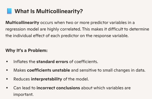
- Mahalanobis: Assumes multivariate normality, needs mean and covariance matrix, sensitive to multicollinearity.
- SNR: Assumes Gaussian noise, often univariate, simpler to compute.
🔍 Outlier Detection Use Cases
- Mahalanobis: Best for multivariate outliers in correlated datasets (e.g., finance, bioinformatics).
- SNR: Ideal for signal processing, image/audio analysis, sensor data.
⚖️ Strengths and Limitations
| Aspect | Mahalanobis | SNR |
|---|---|---|
| Strengths | Accounts for feature correlation; effective in multivariate settings | Simple, fast, intuitive; good for real-time systems |
| Limitations | Sensitive to covariance estimation; assumes normality | Ignores feature relationships; limited to univariate or low-dimensional data |
✅ When to Use Which
- Use Mahalanobis when working with multivariate, correlated data and need statistical rigor.
- Use SNR when analyzing signal strength in univariate or low-dimensional contexts.
📌 Top Statistical Outlier Detection Algorithms
| Algorithm | Core Idea | Best For | Limitations |
|---|---|---|---|
| Z-Score | Flags points with standardized values beyond a threshold (e.g., |Z| > 3) | Univariate, normally distributed data | Fails on skewed or non-normal data |
| Interquartile Range (IQR) | Uses Q1 and Q3 to define outliers beyond 1.5×IQR | Simple, robust for small datasets | Limited to univariate data |
| Mahalanobis Distance | Measures distance from mean accounting for covariance | Multivariate, correlated features | Assumes normality; sensitive to covariance estimation |
| Local Outlier Factor (LOF) | Compares local density of a point to its neighbors | Non-linear, high-dimensional data | Requires tuning of neighborhood size |
| Isolation Forest | Randomly partitions data; outliers isolate faster | Large, high-dimensional datasets | Less interpretable; random behavior |
🔍 Key Comparisons
- Interpretability: Z-Score and IQR are easiest to explain; Isolation Forest and LOF are more complex.
- Multivariate Support: Only Mahalanobis, LOF, and Isolation Forest handle multivariate data well.
- Distribution Assumptions: Z-Score and Mahalanobis assume normality; IQR and Isolation Forest are distribution-free.
- Scalability: Isolation Forest scales best to large datasets; Mahalanobis and LOF are more computationally intensive.
✅ When to Use Which
- Z-Score: Small, normally distributed datasets
- IQR: Simple, robust univariate analysis
- Mahalanobis: Multivariate Gaussian data with known covariance
- LOF: Complex, non-linear data with local density variations
- Isolation Forest: Large-scale, high-dimensional anomaly detection
Sources: Spot Intelligence
IN-V-BAT-AI helps you recall information on demand—even when daily worries block your memory. It organizes your knowledge to make retrieval and application easier. 🔗
Source: How People Learn II: Learners, Contexts, and Cultures
Copyright 2025
Never Forget with IN-V-BAT-AI
INVenting Brain
Assistant Tools
using Artificial Intelligence
(IN-V-BAT-AI)
Since
April 27, 2009
April 27, 2009